blog
April 08, 2019
How really Your Android may look like? - an interview.
This may come in handy:


If You like GUI customizing and use Android - the Kustom app series may be a pretty neat choice. They allow You not only to customize a lockscreen, widgets, or live wallpapers - but to design them completely from scratch, fully according to Your taste. So those apps are not of a kind in which a couple of taps will be enough to be happy with the result - on the other hand, however, the scale of possibilities... seems to be imposing, confined mainly by Your Own imagination and creativity.
Recently I stumbled upon two theme-reach so-called "preset" packs for Kustom Live Wallpapers (don't let the name to confuse You - many of them You can freely use also within all the rest Kustom apps, by a simple copy&paste method, taking an element out of some live wallpaper and placing it on the lockscreen, for example). The packs are called YKP One and YKP Two - and their author is Jacek "Yaatzek" Kazimierowicz. Here are a handful of comments from Google Play:
"some of the best klwp presets around"
"These presets have the most amazing animations".
"The most imaginative, well designed and beautiful set of presets I have yet to encounter".
"the unique artistry on this preset pack is amazing"
"The themes always push creativity and elegance to new levels".
I also consider Myself among the ones impressed by these sets. First, they are pretty reach (their YouTube presentations are over half an hour long - though consisting with just a brief look on each theme). Second: I was much impressed by their diversity: You will find presets of a pretty different style - from futuristic, through computer graphics' classic abstraction, even to cartoonish look. Though I haven't got the impression of a "show-off", but more of an author who really cares to render a particular climate. As a result the presets often have their own individual character - and, since there are a lot of them, there is a good chance for everyone to find something well-suit their taste. For example, with Actars You may feel like being on a spaceship deck.
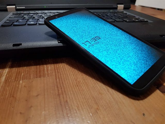
Gridot takes You back to the melancholy times of first cellphones with characteristic, pixelated displays.
With Tilore You'll find Yourself underwater, among beautiful shimmering objects,
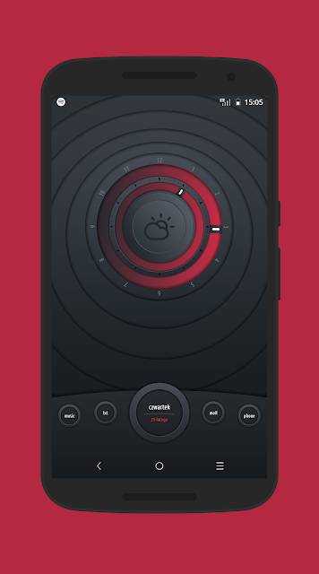
Knob with Knob2 may please classical Hi-Fi sets' lovers.
Another tribute to the past is the DigTrix, with which You may feel like Neo or Trinity :) .

The climatic Dream may fits any sentimental or reflective soul,
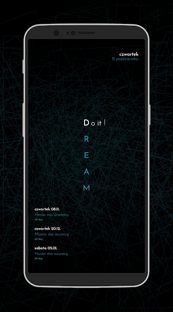
while Rion - painting amateurs (with this composition I felt like being virtually inside the painting - I'm just not sure, by van Gogh, Picasso, or Salvador Dali ;) ).
Moreover, if the Kustom apps are not completely new for You, You can adjust part of them to Your Own liking - by choosing Your favorite colors or preferable animation speed.
To make a long story short, let's go back to the one behind all of it: Jacek "Yaatzek" Kazimierowicz.
First of all, please introduce Yourself: who You are, what Your interests/passions are?
I'm a normal guy with a wonderful family and an ordinary office job. Some time ago I was deeply engaged in mountain bicycles, but when the children showed up, the lack of time has slowly begun. Smartphones emerged and I became passionate on the mobile technology.
Your KLWP presets give the impression of You already having experience with graphics design, especially user interfaces - if so, could You please describe it further (including the fields You are active on)? And if You don't design UX - did You think about it?
I'm an absolute beginner and self-taught, didn't engage in computer graphics before, let alone user interfaces. I am accustomed to the personal computers from the childhood, always feeling comfortable with them - but the graphics as such hasn't been of my special interest. Although I was familiar with Photoshop and the like, but there was no reason I could need those stuff at the time. I never thought of it in terms of a professional career, but maybe someday something will emerge out of it.
App themes You already designed in 2013, and maybe even before. How and when Your adventure with a computer began - and what about theme designing as such, and the Kustom itself?
I am accustomed to computers from the childhood, Commodore, Atari, Amiga, the first PC's. This was mainly a fun and learning at the time. After middle school I began studying information technology, but programming definitely was not of my thing.
The theme adventure began just after buying my first smartphone (it was the first Samsung Galaxy S). First, play with custom roms, rooting, etc. - it was a completely different world than computers. At some point Cyanogenmod showed up, which allowed to load system themes. I much liked the idea that I can choose - in a way - the aesthetics of how an operating system of my phone looks like. Customization ability was something new and fresh. I've never encountered such a thing before. Soon after this I discovered TSF Shell launcher, which looked amazingly at the time. But the small obstacle emerged: the OS color theme completely didn't match to the one used in the launcher. Unfortunately I hadn't found a theme which could fit perfectly, so I've decided to make it by myself, for my own purpose. After all, it seemed quite simple: all the needed tools and basic knowledge I took out of the XDA forum. I decompiled the app, found appropriate graphic elements, modified them in Paint.Net, recompiled and voilà. I decided to make it available on the XDA and it turned out that people like it. Then it snowballed: once I did the blue one, then maybe I should do the red, green, and maybe something of a completely different style. Then I opened a developer account and began to share themes through Google Play.


In the meantime I became engaged into rom (SlimRom) and some apps (Timely Alarm Clock, BlueMail) translation into the Polish language.
At some point I stumbled upon Zooper - an app for creating widgets, acting similarly to Kustom - but before I completely dived into it, the Kustom itself had emerged. And that's how it all began.
"(...) programming definitely was not of my thing" - so would You describe Yourself rather as a humanist? How does it correspond to You writing various formulas in Kustom - the least grateful job?
Yes, I suppose I'm a type of a humanist. But since I scratched the surface of programming, I somehow manage those formulas. Although sometimes some issue emerged, but then I can easily find help among the Kustom community.

I also have warm memories of CyanogenMod's possibilities - thanks to which I was able to enjoy a much more attractive Android, especially given that it was possible to modify more OS's GUI elements (the thing which is around again only years later). Are You familiar with CyanogenMod's successor - LineageOS? If so, what Your impressions are?
At some point I grew out of custom roms. Using pure Android I came to the conclusion that I don't need anything else. Including these several additional configuration possibilities which became unnecessary. Besides, owning the root became problematic: a lot of apps hadn't been working on such devices (banking apps). Due to manufacturers became less willing to share source code of their new devices and software, most of those custom roms hadn't worked fully stable and without issues. Once I had this situation: I was on the way to meet with my friend somewhere outdoors, at some point I pull out the phone to call him - it turned out that it went into a bootloop. Fortunately, at the time I had all the necessary files on phone's storage and it took several minutes to put the OS back on track. It was a stable version of CyanogenMod... Smartphone should simply work, I can't allow myself such incidents.
In terms of Kustom: did You learn completely "by trial and error" - or maybe You've stumbled upon some valuable instructions, how-to's, etc.?
I never used any instructions - especially given that there wasn't such a thing at the beginning. Maybe some basic FAQ, that's all. I back-engineered a couple of themes and then it somehow kept going. It turned out that the biggest help was the community of people gathered around Google+, sharing their ideas and helping to solve problems. Years after Google has considered the platform a failure, but for "us", homescreen designers, it was the best place to share our own work and concepts.
Your compositions are distinctly diversified style-wise, what makes to think that You are pretty flexible in design, feeling well with pretty different, various climates. Do You just like to design in various "spirits" - or maybe, after all, You have some style which You prefer the most?
First of all, each time I try to do something different, something new. I don't want to be pegged into some single style. A couple of my first themes were strongly inspired by works of others, but over the time I became more self-confident and went my own way.
After each finished project I reset myself: I put nothing but some simple picture on my phone's desktop. Then I wait for an impulse, ideas and inspiration - although it sounds like cliché, I take it out of life. Sometimes I see some fine picture, sometimes something interesting on TV, Internet, sometimes I see something while driving. Besides I often begin with a black screen, adding some shape, e.g. a circle, re-shaping it, changing its color - and suddenly something is emerging.


How long on average does it take to design such a preset with its own individual character?
It depends on its complexity, but also on the amount of free time. The simpler ones take a couple of days, whereas the more difficult ones sometimes reach up to two weeks. But it's not that I constantly sit with the phone during those couple of days. I have a normal life, family, job, so there is not much time for designing during the day.
Interestingly, You often engage other users in new compositions' creation - not only showing them another stages of work, but consulting various ideas/directions of development. This is a surprising model, when it comes to think about those designers who experience "always picking and choosing" syndrom with their clients - what may successfully disencourage to engage anyone into the creating process. What makes You choosing this way - and feel well with it?
Some time ago I came to the conclusion that since I "sell" themes, they are not only for me. People from all around the world use them, so why they wouldn't be able to influence their creation. I keep them in the loop, showing how the process of preparing each theme is going. And after some time I think that it was a very good idea. First, from a user's perspective it can be seen how does such a process take place, and besides, based on their feedback I could tell if something will meet their interests, or will became a crap. The final decision was, after all, mine - but this way I can better fit the tastes.
You also often consult various technical matters with Kustom apps' team - how You perceive their responsiveness and cooperation?
Behind Kustom apps stands one man - Frank Monza, I have a very good contact with him from the very beginning, we often work together on solving some issues. From the beginning he tries to be up-to-date with fixing bugs - and with each version he adds some new features. On this website everyone can report bugs, issues, but also the ideas of new features.
I like that You often utilize the same elements in several different compositions. This way You show how well those objects fit pretty different environment. I find it a good example of creative design, especially for those who would like to get their foot on the ladder. Speaking of the beginners, what advice You'd give someone who wants to start designing their own Kustom presets? Is it hard to learn?
On the beginning it's good to take a look "under the hood" of other themes, seeing how they are made, what solutions their authors incorporated. Besides, there is Brandon Craft who for years now is doing great job with his worth viewing YouTube instructions.
Due to Google+ being shut down our community splattered on various other social networks, but one can easily obtain help and knowledge on the official Reddit or, for example, Discord.
The biggest problem for beginners is always the editor, i.e. the app's interface. Most of us is "teached" that if there is a theme - it should be enough just to tap somewhere and that's it. Kustom's specifics is unfortunately that You need to dive a little deeper and learn a little, but believe - it's worth it.
It's true that this is not the case in which one single tap is enough to go. That's why so many people quickly are discouraged. At first glance the editor in fact looks roughly, but after a while one can get "what is what". It's even a need to became accustomed to it, because each theme should be adjusted to a small degree before applying. You need to set up the proper screen number, app shortcuts, sometimes there are additional - global - settings of customizing a theme.
You've mentioned learning through "back-engineering": taking a look "under the hood" as a way of developing own skills. For some time now, however, some themes don't allow it - due to a feature of locking, applied by their authors. Would You tell more about it, including Your Own approach to the matter?
All my themes are unlocked (or open). Some time ago Frank - requested by theme creators - added a feature of locking a theme. This is about copyright protection. It's known that on the Internet people have taken someone else's work and sold it as their own. From a user's point of view the problem is that, although they is able to edit such a theme, but without the ability of copying and exporting elements of their own modified version. They can only save its current state on the desktop. For me it's absolutely not of a problem that themes would be unlocked - let's them copy. I know from the experience that war with stealing and piracy on the Internet is a losing battle. I don't want all the hassle, time and nerves struggling with this problem. Besides, I decided that confining the users by locking the ability of having a closer look of what is inside, and even further utilization - is simply not fair.
From the technical point of view Your works are definitely complex and advanced - which challenges You recall the biggest, most intriguing so far?
Oh, there were a couple of such: definitely Cirles, Holro or Yotch. They required pretty much work, mainly due to the quantity of used elements and their animation. In Cirles, for example, there are 78 elements, out of which each one has several different animations, equipped with formulas, and each of those elements is in some way connected to each other. The worst was when the theme has been already done, but it turned out that something doesn't work right and I must to correct some formula within dozens of places. Sometimes it required painstaking and uphill job, but it was worth it :) .
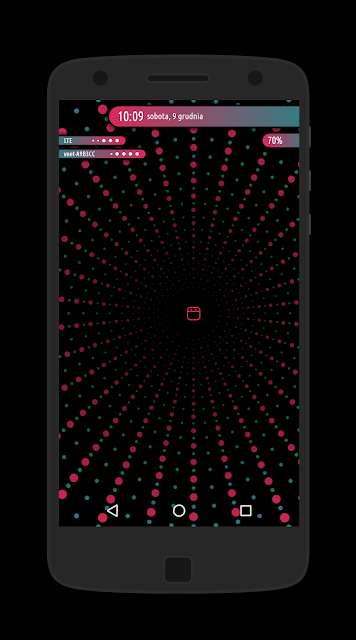


Speaking of 78, let's be it 10368 :) . Will You tell us about this exceptional "komponent"? :) Why bother ;) ?
There is not so much to tell, because this is a very early concept, but I don't know if I'll do anything further with it - on my phone loading and applying the wallpaper takes many seconds. Most weaker devices simply couldn't handle it. And creating this component wasn't so difficult: I've applied a couple of formulas within shapes, related to globals, and then it was easy: hundreds times of copy&paste and that's it :) .
What do You think about Kustom apps as such?
I use KLWP only, it doesn't make sense to use KLCK when we have fingerprint readers and face recognition-based unlocking. We see a lockscreen for a fraction of a second, and sometimes we don't see it at all. I tried KWGT several times, but I always came to the same conclusion: why to do anything in KWGT, while with KLWP I can do more and prettier. Everything comes down to the ability of animating each element, which is the biggest advantage of KLWP and makes it an unmatched tool.
Do You know other "kustomization" apps which You find worth recommendation?
I don't know any of such, nothing is even approximately as good as the Kustom :) .
Besides Kustom You also designed themes and icon sets for various launchers and apps, including TSF Shell, Next Launcher... Poweramp - why those particular ones drew Your attention?
As far as I remember I did themes only for myself, at some point I just began to share them. I did themes for TSF Shell because I needed such at the time, I began to use Next Launcher - so I did themes which fitted me more. Icons didn't fit to the rest of the OS - I did an icon set for myself (at one time - besides so-called icon packs - there were also icon themes - they didn't change the default icons' appearance, but added a background (for example) or were able to add color masks).
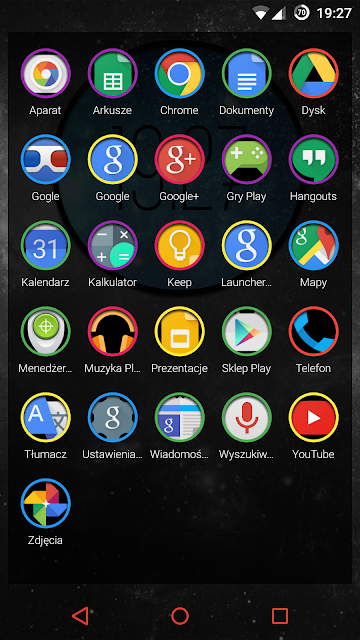

Do You like to customize other fields as well (e.g. preferring Android custom icon sets, another launchers - and maybe Rainmeter for Windows, or other examples of Your Own preference of things looking more "Your way")?
Most of the time I use a phone, being focused mainly on it. Once I used icon packs, but besides the desktop I use default ones. I don't like incomplete things, and every icon pack lacks many apps. Computers I treat only as work tools and I always must to have everything well-arranged - a minimalistic wallpaper and clean desktop.
Which Kustom features You like the most?
As I've mentioned earlier on - animations. I always try to incorporate some movement, at least to a minimal degree. I find it surprising that most themes don't utilize this potential, while this is the app for creating ANIMATED wallpapers.
Among compositions which You've presented on YouTube, My attention also drew themes outside the YKP One/YKP Two: StarTree and WooDots (now I can't find them on Your channel anymore). Is it possible to download them from somewhere? I am enchanted by the aesthetic and elegant animation of starry night in StarTree (although it was visible only on the lockscreen, I suppose - I'm not sure is it a part of the preset, or maybe it's a KLCK preset?) - while My Second Half much likes a pearl-like clock and font from WooDots. :) Besides, I very much like the composition with realistically "painted" numbers on the road (current time) - this one I dug out from Your Google+. We would love to have access to those :) .
The problem (?) is that each theme I consider a complete work, a picture which is currently painted. After finishing I don't come back to it. Unfortunately, old themes, i.a. those which You've mentioned, stopped look well on new devices. Some time ago manufacturers introduced new screen proportions and if a theme wasn't adapted to it, it will simply look bad. It couldn't be predicted at the time of their creation. In order to adjust them I must to come back to each one and virtually re-design the whole thing. So a little dilemma has emerged: to take time to "repair" old ones, or to focus on the new ones? Year ago I conducted a survey on G+, most of votes were like: "damn it, we want new themes!" :) . That's why old themes I temporarily removed, until I find the time for their adjustment.
Do You have some favorite kustom preset - either out of Your Own, and other authors? And which one You use currently?
I've never used other users' themes - not because they are bad, I just more like my own ;) . On my desktop I always have some of my themes, and if I like to rest, I put some minimalist wallpaper.
What software You use to design? Do You remote access Your smartphone? Which tool You prefer for this task?
Everything but app compilation (in AndroidStudio) takes place on the smartphone. A theme is of course created within the Kustom editor, the only exception is writing long lines of code within formulas - then I connect the phone with the PC via TeamViewer and this way enter the text.
Promotional screenshots I do in Screener.
For promotional video-clips I use a very fine app Quik.
Whereas for screen recording I use AZ Screen Recorder.
Don't You use Photoshop for drawing anything at all?
Anything. Once I created some graphic elements outside of Kustom editor, but soon I've discovered the limitation of such a solution. While creating shapes, objects within Kustom You are able to freely modify them at a later time, with no problem You can change the shape, color, etc. With graphics which are done - You can't do that.
Years ago You used Nexus 5 - what smartphone(s) You use currently? Do You have good memories related to that Nexus or some other devices?
Nexus series was brilliant: yes, they had drawbacks - but price-quality relation, alongside with pure Android and update warranty - that was something. I have a very good memories of it, and I now know that if Android - then only the "pure" one. Nowadays I am very glad with OnePlus 5T I currently use.
Here You surprise Me, I'd expect You to be an advocate of visually modified Android distros - I mean mainly such ones which allow applying themes, covering as many UI elements as possible. Thanks to that, for example, we could enjoy dark-themed Android in Xiaomi/MIUI devices long before Google embraced this feature - let alone this is still only one single dark theme at Google, while with MIUI we could have a pretty handful of those to choice.
In my case a smartphone took over most of the features and actions I used to do on the PC - and on top of that it added many more features, which haven't been out there before, becoming a kind of a personal, technological aiding tool. Now it replaces a lot of devices, which once we use separately: a phone, a computer, a camera, a music player... During those years of using various things I came to conclusion that only those without manufacturers' interference into the software allow to use Android fluently, comfortably and without issues. The ability of modifying the system appearance or its other aspects went farther. A phone should first and foremost to serve reliably, fluently, fast and comfortably. This is what pure Android is like. I have a lot of friends who have had various issues with Xiaomi, Huaweii or other phones - something was incompatible, something gave errors. One of the recent examples: a friend bought a new car with Android Auto, wanted to connect his - also recently bought - Huaweii P20 Pro... and it didn't work. I read somewhere on the Internet that Huaweii didn't get the certification related to Android Auto, or something like that, and currently doesn't support it... Some updates were supposed to be published, but I don't know how it ended up finally.
If You could posses any out of existing smartphones - what would be Your choice, and why?
None :) . I can't accept those current smartphone screens - notches and hole punches simply look awful. I just wait this crazy time till manufacturers begin to produce normal screens again.
Do You design KLWP presets only, or maybe You also considered creating something especially for KLCK/KLWG?
Once I've tried, but as I've mentioned before, it hasn't turned out my thing.
Many of Your solutions would be a good topics for how-to's. For example I am intrigued how did You construct dots which are moving over the circles, with gradient trace behind, like gradually disappearing comet's tail (Actars) - or custom progress bar in Wablu? Would You unveil "a secret" how to achieve such things?
Those "dots" are quite simple ;) . Just:
- Add a layer.
- Add a shape within it - a circle slice.
- Set its height, width and angle, add a sweep gradient - and we have the tail.
- Now, inside this layer, add a new one, inside which create another one and here add 4 small triangles. Each of them rotate in an appropriate way - besides, to each of those triangles set a horizontal gradient. Then add a small square and make its corners as round as possible (a square, because small circles look pretty bad). Now rotate the layer with a square and triangles by 45 degrees, and within the superior layer set an appropriate bottom padding, in order for it to fit the tail.
- Finally it will be enough to add a simple animation loop with rotation, linear move and any duration.
Speaking of Wablu's battery progress bar, this was a painstaking work. I wrote the code which pointed the exact position of the indicator for each battery percentage:
$if(bi(level)=100,70,if(bi(level)=99,74,if(bi(level)=98,78,if(bi(level)=97,82,if(bi(level)=96,86,if(bi(level)=95,90,if(bi(level)=94,94,if(bi(level)=93,98,if(bi(level)=92,102,if(bi(level)=91,106,if(bi(level)=90,110,if(bi(level)=89,114,if(bi(level)=88,118,if(bi(level)=87,122,if(bi(level)=86,124,if(bi(level)=85,126,if(bi(level)=84,128,if(bi(level)=83,128,if(bi(level)=82,130,if(bi(level)=81,130,if(bi(level)=80,130,if(bi(level)=79,132,if(bi(level)=78,132,if(bi(level)=77,132,if(bi(level)=76,132,if(bi(level)=75,132,if(bi(level)=74,132,if(bi(level)=73,132,if(bi(level)=72,132,if(bi(level)=71,132,if(bi(level)=70,132,if(bi(level)=69,130,if(bi(level)=68,130,if(bi(level)=67,128,if(bi(level)=66,126,if(bi(level)=65,124,if(bi(level)=64,122,if(bi(level)=63,118,if(bi(level)=62,116,if(bi(level)=61,114,if(bi(level)=60,112,if(bi(level)=59,108,if(bi(level)=58,104,if(bi(level)=57,100,if(bi(level)=56,96,if(bi(level)=55,92,if(bi(level)=54,88,if(bi(level)=53,84,if(bi(level)=52,80,if(bi(level)=51,76,if(bi(level)=50,72,if(bi(level)=49,66,if(bi(level)=48,62,if(bi(level)=47,56,if(bi(level)=46,52,if(bi(level)=45,48,if(bi(level)=44,44,if(bi(level)=43,40,if(bi(level)=42,36,if(bi(level)=41,32,if(bi(level)=40,28,if(bi(level)=39,24,if(bi(level)=38,22,if(bi(level)=37,20,if(bi(level)=36,18,if(bi(level)=35,16,if(bi(level)=34,14,if(bi(level)=33,10,if(bi(level)=32,8,if(bi(level)=31,6,if(bi(level)=30,6,if(bi(level)=29,6,if(bi(level)=28,6,if(bi(level)=27,6,if(bi(level)=26,6,if(bi(level)=25,6,if(bi(level)=24,6,if(bi(level)=23,6,if(bi(level)=22,6,if(bi(level)=21,6,if(bi(level)=20,8,if(bi(level)=19,8,if(bi(level)=18,10,if(bi(level)=17,12,if(bi(level)=16,12,if(bi(level)=15,14,if(bi(level)=14,16,if(bi(level)=13,18,if(bi(level)=12,20,if(bi(level)=11,22,if(bi(level)=10,26,if(bi(level)=9,30,if(bi(level)=8,32,if(bi(level)=7,34,if(bi(level)=6,38,if(bi(level)=5,42,if(bi(level)=4,46,if(bi(level)=3,50,if(bi(level)=2,54,if(bi(level)=1,58,if(bi(level)=0,62)))))))))))))))))))))))))))))))))))))))))))))))))))))))))))))))))))))))))))))))))))))))))))))))))))))$
At some point I've read that You've been working on location-dependent wallpapers - could You tell more about it?
It was slightly different: till the last year Google Map API could be used free of charge. It enabled to obtain static pictures out of a given location, with the ability of any visual adjustments. Thanks to that You could use such a picture as an element of a theme, e.g. a subtle background with a current location. Unfortunately Google turned this feature off at the end of the last year, and now in order to use it one need to create their own private API key and enter it in the proper place.
What is Your source of inspiration for new projects? Could You point out examples of such "ignition" inspirations for various presets?
From everywhere ;) . Stags, for example, has been inspired by opening to the "Nielegalni" tv series, whereas the inspiration for Retel was a fine, designish watch.
Besides, I often browse portals such as Dribbble or Behance, one can find a great many of interesting ideas there. If I need some photos, I rummage through Unsplash - there are a lot of great photographs there.
One of exciting Kustom features I find gyroscope animations - at first glance I was intrigued did You apply them within Gyli, Wetoon, Stags presets (speaking of moving elements, clouds, or movable clock - with the impression of movement by moving the device itself), or do You use it at all? I find it a controversy, because I belong to those users for whom this very Kustom feature doesn't work for no apparent reason (so, despite of applying the presets, I don't experience those animations which may be viewed on YouTube).
I am not so excited about those gyroscope animations ;) , but sometimes they add a fine 3D effect. It happens very rarely that I have a complete design ready in my head - most of the times this is a kind of a creative improvisation. Will such animations be involved or not, turns out on the fly.
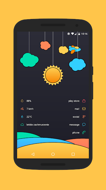
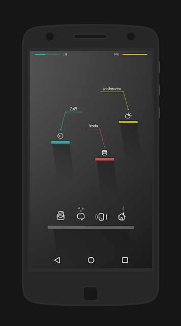

You are an enthusiast of exploiting live wallpaper potential to the maximum - how would You describe "a real live wallpaper"?
Of course - this is why the app has been created: in order to design alive, movable wallpapers, interfaces. And I don't mean just a touch-related animation, i.e. tap some button and then something moves, hides. But more of a continuous, subtle and slow motion of various elements of the layout. Not always I've managed to achieve such a thing, but I seek for it in every project. Maybe this is because most people associate live wallpapers as something which drastically drains the battery. This is one of the biggest Kustom advantages: it allows continuous animations without a noticeable influence on the battery.
I much like the idea of full-screen weather animations - a great alternative for weather icons, or weather-dependent full-screen backgrounds. Did You do them by yourself from scratch? I also have the impression that You prepared alternative variants of them, e.g. various rain animations (within various compositions it looks differently).
Yes, since we have a tool to create animated wallpapers, why not to show weather conditions in a form of an animation? First, it simply looks fine, and second, we have continuous move I've mentioned before (unless it's clear ;) ). Of course each variant is included: rain, thunderstorm, wind, mist, snow, etc. Each droplet of rain, each snowflake is made out of shapes in Kustom.
In case of some presets it may be a good idea for one to enlarge some of its elements - as in case of beautifully shimmering underwater Tilore. Taking a look "under the hood", however, it turned out not to be so simple. I wonder if You could consider in Your compositions such cases, when a user would like - or need - to enlarge at least their part? Maybe to organize particular elements into groups comprehensive for "an average user", groups which could be then easily scalable, without worrying on each and every "cog"? Or maybe to define sizes with the help of $si(rwidth)$/$si(rheight)$ as a starting point - in order for them to maintain screen-related proportion, regardless of a device?
Since the time of introduction of new screen proportions, all themes I design the way for them to be automatically adjusted to appropriate sizes. Unfortunately those older ones require a re-design, at some point I need to work on it. But due to complexity of most of the themes, implementation of such individual settings for groups would be damn time-consuming. If is there any problem, however, I am always of service - if someone need to adjust something to their own requirements, I often help such users individually. Just email me and it will do.
From time to time You update the collections published on Google Play. You've taken an interesting approach here: the set, once bought, gives its user access not only to eventual bug fixes, regarding current presets - but also to the completely new ones (!). Why You decided for such a thing - and does it mean to abandon an eventual YKP Three?
When I published the first pack, I didn't plan to pull another ones out, I just wanted to add further themes to it. This way the app's description had been shaped: You pay once and receive access both to the current and further themes. So I need to put the money where my mouth was. At some point, however, YKP1 became pretty heavy, reaching almost 100MB, and many users complained about its weight. Then I took the following strategy: each pack will contain 40 themes - when I reach this number, I will create another one, and so on. Keeping the statement accompanying the first pack in mind: if You've bought it, You will receive a free code for all the next. It turned out that most of the users have bought YKP2 out of their own free will anyway. It was a very nice surprise for me, I felt really appreciated.
At the end of 2014 You decided to make all of Your themes (which has been paid earlier on) available for free - what made You to come back to commercial model, regarding YKP One/Two?
I don't make it a secret that I don't mint money on my apps. I treat it rather as a pocket money. Don't remember why I decided to make it free, but soon I've came back to the paid model, for one reason: reviews. People install free apps without a second thought, let alone reading the description. I've received a lot of garbage mails stating that the app doesn't work, etc. Thanks to assigning the price, even a small one, it has been possible to separate from this kind of users almost 100% successfully. If someone has to pay, they do will take a closer look on what they is buying.
Thank You for the dedicated time and will to give this interview, I'm glad that this way we could make the topics of such a great design and Your talent, as well as Kustom apps' potential, closer to the customization enthusiasts. I wish You further impressive achievements and much satisfaction and enthusiasm in the users' eyes :) .
------------------------------------------------------
If You are interested to dive deeper into themes by Jacek, here You'll find a wider presentation:


No comments:
Post a Comment