blog
September 17, 2018
Mobile website in Blogger - a handful of clues.
This may come in handy:


One nice thing about Blogger is that it may often surprise You in a quite positive way :) . One example would be how it handles mobile websites.
As You may know, today more and more often we browse the Web via mobile devices. It began years ago with WAP, but this is an ancient history - over the years the whole thing has grown enormously. From the technical point of view a major change would be the split between classical websites (as we know them) and their mobile counterparts. The point is that significantly smaller screen-sizes enforced technology to adapt to the new - mobile - environment: the Web gained its new face.
Mobile face of the Web.
When You're browsing the Internet via a smartphone (for example), You probably don't think on the reason why this particular website looks this way, not another. Or why it looks differently than on Your Windows/Mac PC. Sometimes the same website looks quite similar both on desktop and mobile devices - sometimes there are more discrepancies between the two. One way or another, usually mobile websites are more simplified (smaller screen size inspires to prioritize what is more - and what is less important to occupy available space).
In terms of Google Blogger it's good to know that mobile version of Your site will be created automatically. It is important because usually there is a need to prepare a special, separate version of a website in order for it to be properly and optimally displayed on mobile devices. So here Blogger helps You out in preparing such a version.
The funny thing is You don't need to do anything to construct a mobile version of Your Blogger website: it is created out of a box, alongside the standard one. Although it is quite simple-looking, it will do its job (i.e. ensure the proper display of Your web page on mobile devices).
Another important thing worth knowing is that regardless of how sophisticated the layout of Your website is - the automatically generated mobile version will be looking the same simplistic way, as if totally independent. So what about if You care about the design and especially how Your website stands out from the crowd - representing Your content, Your brand, and finally - You? This is the point when You need to learn how to implement Your Own style into Blogger mobile :) .
First things first.
Before You introduce any part of Your mobile design - You need to deactivate the basic version Blogger sustains out of the box. Enter the Blogger dashboard, choose "Theme/Mobile/gearwheel icon" and set it to "Custom". Now the mobile version of the website is in Your hands :) .
How does it work in general?
Technically-wise the most important thing You should know is that there is no separate templates for desktop and mobile (this is the reason why there is no "edit" button accompanying mobile section). Instead, here and there within the desktop template's code You can point out which code snippet is dedicated especially for the mobile. For example, while constructing the menu (writing its code) You could differentiate two ways for it to be rendered: on desktop - and on mobile devices. If You are working with gadgets, You also need to add a short 'activator' (mobile="yes") which enables it to be functional also on the mobile.
On top of that there is a little bit more complicated, alternative way in which You create completely separate menu within an appropriate - mobile - section (e.g. section making up a mobile article page, articles' listing, mobile welcome page and so on).
The CSS case looks similar: You can either point out mobile directives "here and there" (wherever You find it appropriate) - or You can simply add a whole separate style sheet at the end of the current one (if You don't take the 'Mobile First' approach). Let's see how it looks in the code.
jQuery scripts.
On this site I often share various jQuery ideas which could come in handy. To enable them on a mobile Blogger website You need just to add mobile="yes" to the proper gadget (i.e. the one which You use to contain jQuery commands). Since we use HTML/JavaScript gadget for this purpose - its opening code could look like this:
<b:widget id='HTML1' locked='false' mobile="yes" title='Engine' type='HTML'>
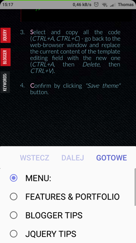
Mobile Blogger menu.
<b:if cond='data:blog.isMobile'>
the whole mobile menu code
<b:else/>
the whole desktop menu code
</b:if>
Here is a simplified working example from this site:
<b:widget id='PageList1' locked='false' title='' type='PageList' visible='true'>
<b:includable id='main'>
<b:if cond='data:blog.isMobile'>
<select expr:id='data:widget.instanceId + "_select"'>
<b:loop values='data:links' var='link'>
<option expr:value='data:link.href'><data:link.title/></option>
</b:loop>
</select>
<b:else/>
<ul>
<b:loop values='data:links' var='link'>
<b:if cond='data:link.isCurrentPage'>
<li><a class='selected' expr:href='data:link.href'><data:link.title/></a></li>
<b:else/>
<li><a expr:href='data:link.href'><data:link.title/></a></li>
</b:if>
</b:loop>
</ul>
</b:if>
</b:includable>
</b:widget>
Issue with the first mobile menu item.
While working with a menu in a form of a pull-out <select> list (generated by the PageList gadget) I encountered a strange issue: the first menu item didn't work properly (no action after clicking/tapping). To solve that issue I used following jQuery workaround (just add this code to Your HTML gadget for jQuery commands):
/* Menu Mobile - start */
$("#PageList1_select option:first").text('menu:').after("<option value='http://YourSiteAddress.blogspot.com?m=1'>Start</option>");
/* Menu Mobile - end */
What it does is: 1) it changes the text of the first menu item to the "menu" (I use it as menu title, indicating that here is a menu to pull out) and 2) it adds a properly working first item, leading to the main page. All in one nice line of code, thanks to jQuery chaining.
Mobile Blogger Welcome Page.
Blogger doesn't provide a welcome page feature out of a box, but You can easily incorporate it into Your template, using b:if conditional tag. It could look as follows:
<b:if cond='data:blog.url == data:blog.homepageUrl'>
...content of Your welcome page...
</b:if>
You could put this code just after the following one:
<b:widget id='Blog1' locked='false' mobile="yes" title='Posty na blogu' type='Blog'>
<b:includable id='main' var='top'>
In case You'd like to create a separate version of a welcome page meant for the mobile - as a content of this b:if tag You need to put additional b:if and b:else tags. This "filling" could look like this:
<!-- Mobile HomePage -->
<b:if cond='data:blog.isMobile'>
...content of the mobile welcome page...
<!-- Mobile HomePage -->
<!-- Desktop HomePage -->
<b:else/>
...content of the desktop welcome page...
</b:if>
<!-- Desktop HomePage –>
Mobile Blogger Single Article Page.
This one (as well as article listing) You may handle with the help of b:includable tag (creating a separate b:includable for the mobile). The code would be as follows:
<!-- Single Article - Mobile ver. -->
<b:includable id='mobile-post' var='post'>
...the actual mobile post template...
</b:includable>
<!-- Single Article - Mobile ver. -->
A good place to put this code within the template could be just before this line:
<b:includable id='post' var='post'>
Mobile Blogger Article List Page.
Similar way You could handle an article list:
<!-- Article List - Mobile ver. -->
<b:includable id='mobile-index-post' var='post'>
...the actual mobile article list template...
</b:includable>
<!-- Article List - Mobile ver. -->
You could put this code just before (or after) the snippet for a single article (mobile ver.) mentioned above.
Mobile Blogger Style sheet.
The easiest way could be to put all the mobile CSS commands in one place: at the end of the existing style sheet. You could put the following code there:
/* Mobile CSS */
@media all and (max-width: 800px)
{
all mobile CSS instructions here
}
Note that I used 800px as a conditional boundary determining when exactly those CSS commands should be applied (in the example above: wherever the screen width is smaller than 800px). If I confine Myself to use just this one additional style sheet - it will cover all mobile devices at once: tablets and smartphones of various screen sizes. If You, however, would like to adjust the look of Your site in a more detailed way, You could add another style sheets with different width limits, meant to cover some particular groups of devices, or even dedicated to the specific ones.
Mobile comments.
This one I didn't figure out yet. So far I've discovered that You may encounter some difficulties with a comment form displayed in the mobile version. Although there are some workarounds for this issue - in My case they aren't enough. I'm going to share the solution if I develop a fully effective approach.



No comments:
Post a Comment